Image Element
This guide provides detailed instructions for using the Image Element in Construct, including its settings, properties, and metadata.
Overview
The Image Element allows users to embed images within Construct content and customize their presentation settings for different outputs.
Requirements
- Access to the Construct platform.
- Administrator or content editing permissions.
- Appropriate image assets uploaded to the Asset Library.
Element Settings
General
Locked
The Locked checkbox, labeled Lock this and children, secures the content item and its associated nested elements.
Children refers to elements nested within others, such as:
- Elements under Key Learning Points (KLPs),
- KLPs under Teaching Points (TPs),
- TPs under Learning Objects.
 Figure 1: Locking Function
Label
The Label field creates a unique identifier for the content item, used for debugging and auditing purposes.
- Clicking the return icon resets the label to the default text: "New Component Title".
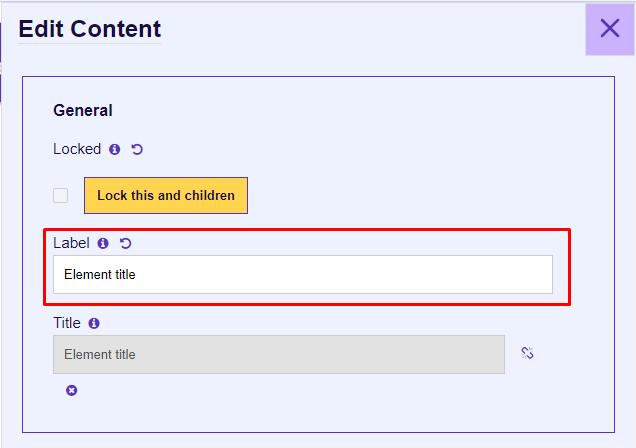 Figure 2: Element Label
Title
The Title field specifies the display title of the content item, shown in the Presentation view and Word outputs.
- By default, the title is linked to the Label. You can unlink it by clicking the chain icon.
- The Title can be left empty, and it takes the KLP Title in Presentation and Instructor/Student views.
 Figure 3: Title Input
Properties
Image File
The Image File property allows users to select or upload an image asset:
- Select an Asset: Choose an image from the Asset Library or upload a new one.
- Select an External Asset: Currently non-functional.
 Figure 4: Adding an Asset
Alignment
The Alignment dropdown determines the image's alignment within the output block:
- Left
- Center
- Right
 Figure 5: Alignment
Print Page Size
The Print Page Size dropdown specifies whether the image uses:
- Default A4 size (Word outputs).
- A3 size (Word outputs).
 Figure 6: Print Page Size
Print Page Layout
The Print Page Layout dropdown specifies whether the image is rendered in:
- Portrait
- Landscape
 Figure 7: Print Page Layout
Output Types
ILT (Instructor-Led Training)
When ILT is selected, users can specify ILT Settings:
- Instructor: Displays the element in the instructor presentation window (text and list components only).
- Student: Displays the element in the student presentation window.
 Figure 9: ILT Output Types
Word
When Word is selected, users can specify Word Settings:
- Student Notes: Includes the element in the Student Manual output.
- Instructor Guide: Adds the element to the Instructor Guide and the instructor presentation window (text and list components only).
 Figure 10: Word Output Types
Metadata
Job Roles
Use the Job Roles dropdown to assign roles.
- Accessible via: Hamburger menu > Administration > Metadata.
 Figure 9: Job Roles Metadata
Other Metadata
The Other Metadata button allows for custom metadata, primarily used during migration.
 Figure 12: Other Metadata
Save Changes
Important: Always click Update to save changes. Unsaved changes will be lost upon exit.
To discard changes, click Cancel or the purple X button.
 Figure 13: Update and Cancel Buttons